Singapore's OCBC Bank
The Singapore OCBC Bank’s website gives visitors and customers the opportunity to explore a range of the bank's products and services
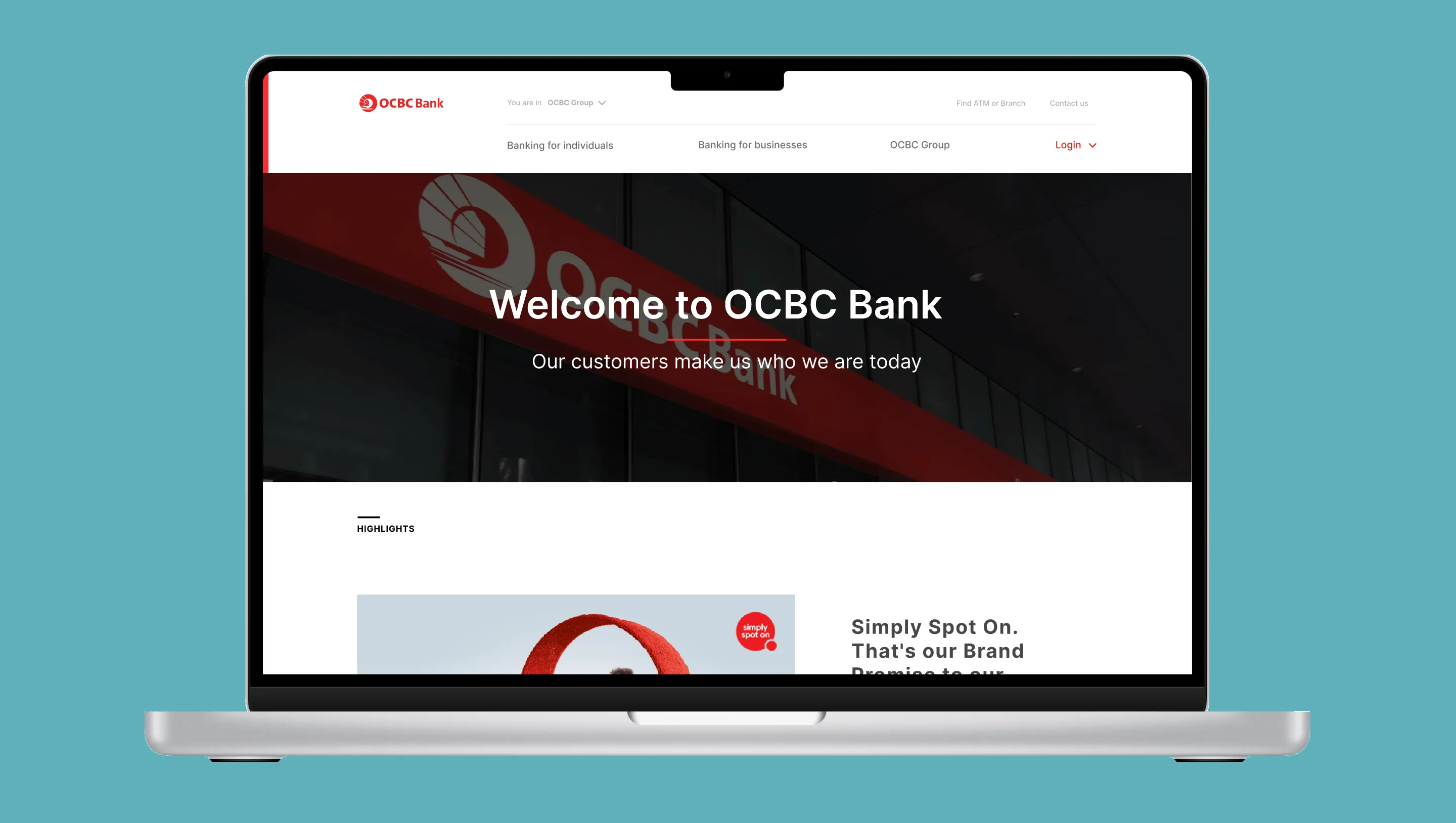
Singapore OCBC Bank's Website
The Singapore OCBC Bank’s website gives visitors and customers the opportunity to explore the bank’s various offerings
Methodology
Challenges
The task was to identify pain-point(s) experienced by users with the Bank's website and correct it. After a qualitative survey, it was found that:
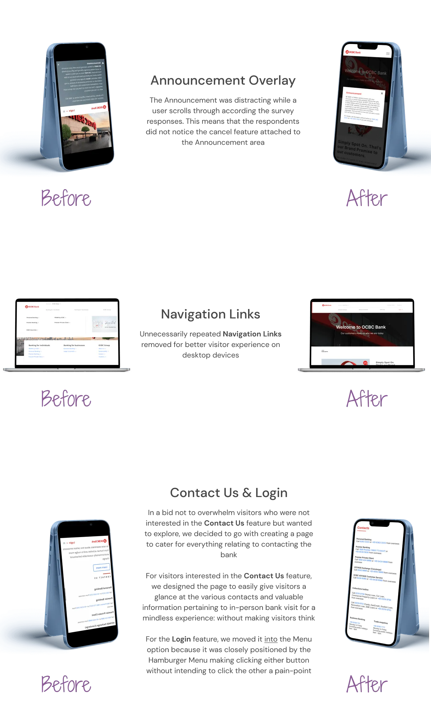
- The Announcement area on mobile devices was too distracting
- Repeated Navigation Links for some features on the desktop version was unnecessary
- The Contact Us section was overwhelming on both the mobile and desktop platforms
It was also realized that OCBC’s website is 74% dirtier than the lot of websites on the internet as it does not use sustainable energy according to Cabin.
Problem Statement
Daniel, who is a student at Singapore Management University, is in need of an account offering that allows him incur very minimal cost in maintaining the bank account while being offered some benefits
Company Profiling
Research/Analysis
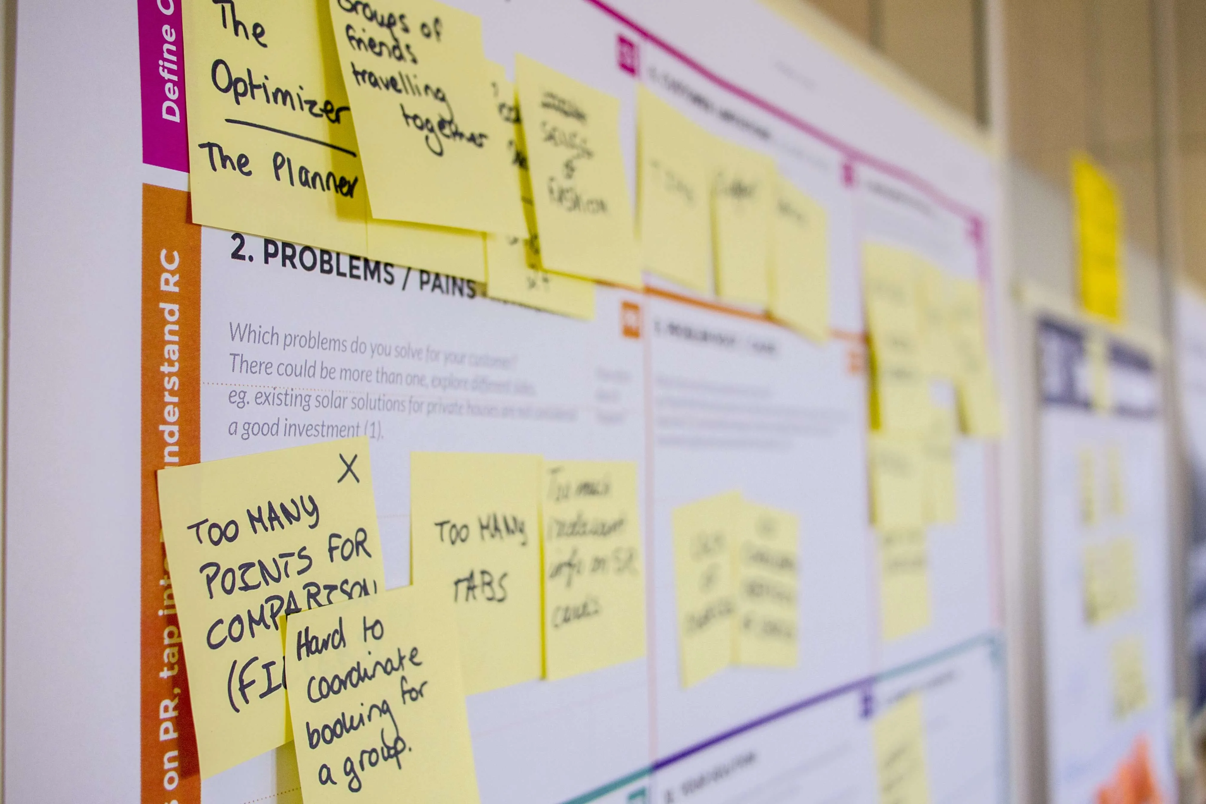
UX Audit
We evaluated the usability and overall user experience of OCBC’s website to know what feature would need improvement and ensure it meets the needs of the users.
User Interview
We carried out User Interviews by employing a Qualitative Research Technique. The survey was carried out via an electronic means: Google Forms; and it was strictly targeted at individuals living in Singapore. By doing this, we ensured that we were dealing with the target market of the Bank’s offerings while factoring in regional culture which could influence any number of decisions.
From the survey, we were able to gather feedback from users about their respective experiences with the website. After which, we analyzed the data gotten so as to identify usability issues.
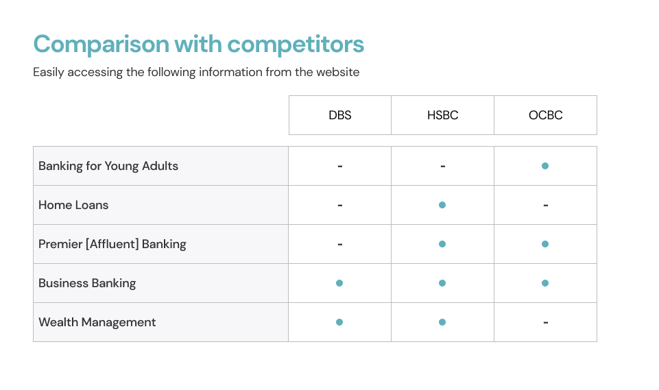
Competitive Analysis
We compared features on each competitor's website and identified inspirations for Singapore OCBC Bank’s website on mobile and desktop devices. After examination, DBS Group and HSBC Singapore were in close competition with the bank. We concluded on the overall Navigation process to bring a more seamless user experience.
Goals
Personas
Daniel, a student aged 24, wants to know more about the service offering but is frustrated with Announcement section fixed to about half his iPhone's screen size
Grace, aged 45, is helping out her boss who is an Affluent suggest a reputable organization to meet his Private Banking demands but she is irritated by the unnecessary Navigation links on the website
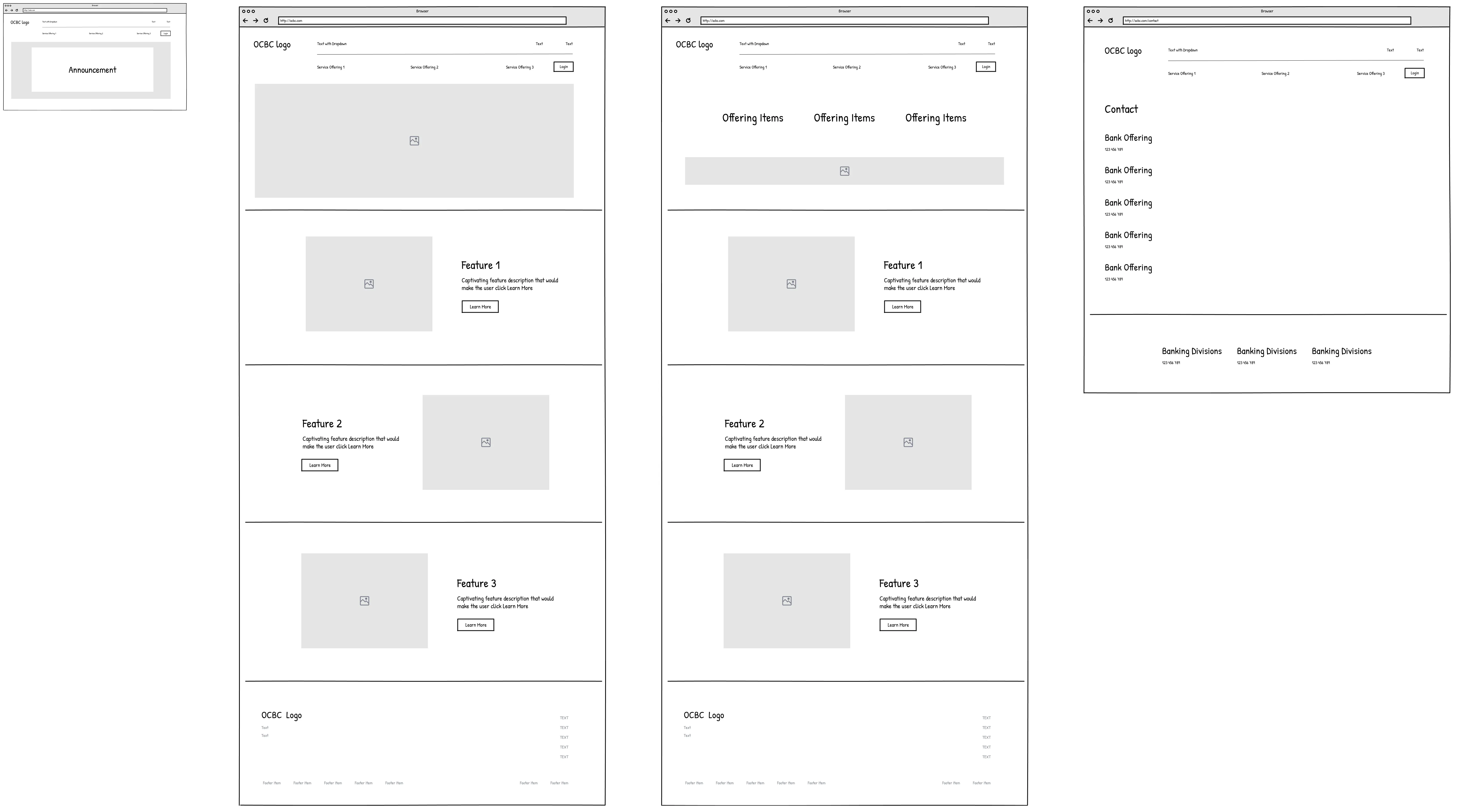
Wireframes
High-Fidelity Prototype
Research Validation/Feedback
Mobile
- Version Two is actually the best for the Announcement
- For the actual site, the font size could be smaller
- Contact Us... could be a smaller font
- Contact Us, Investor... could be organized as two columns to take up less Footer space
Desktop
- Login should be more accessible by putting it at the top (above the search engine)
- Footer background could be different
- The expansion of tab under login could be vertically displayed because there are too many options and it looks a bit messy
- No need for there to be a highlights tab if it is the only thing displayed
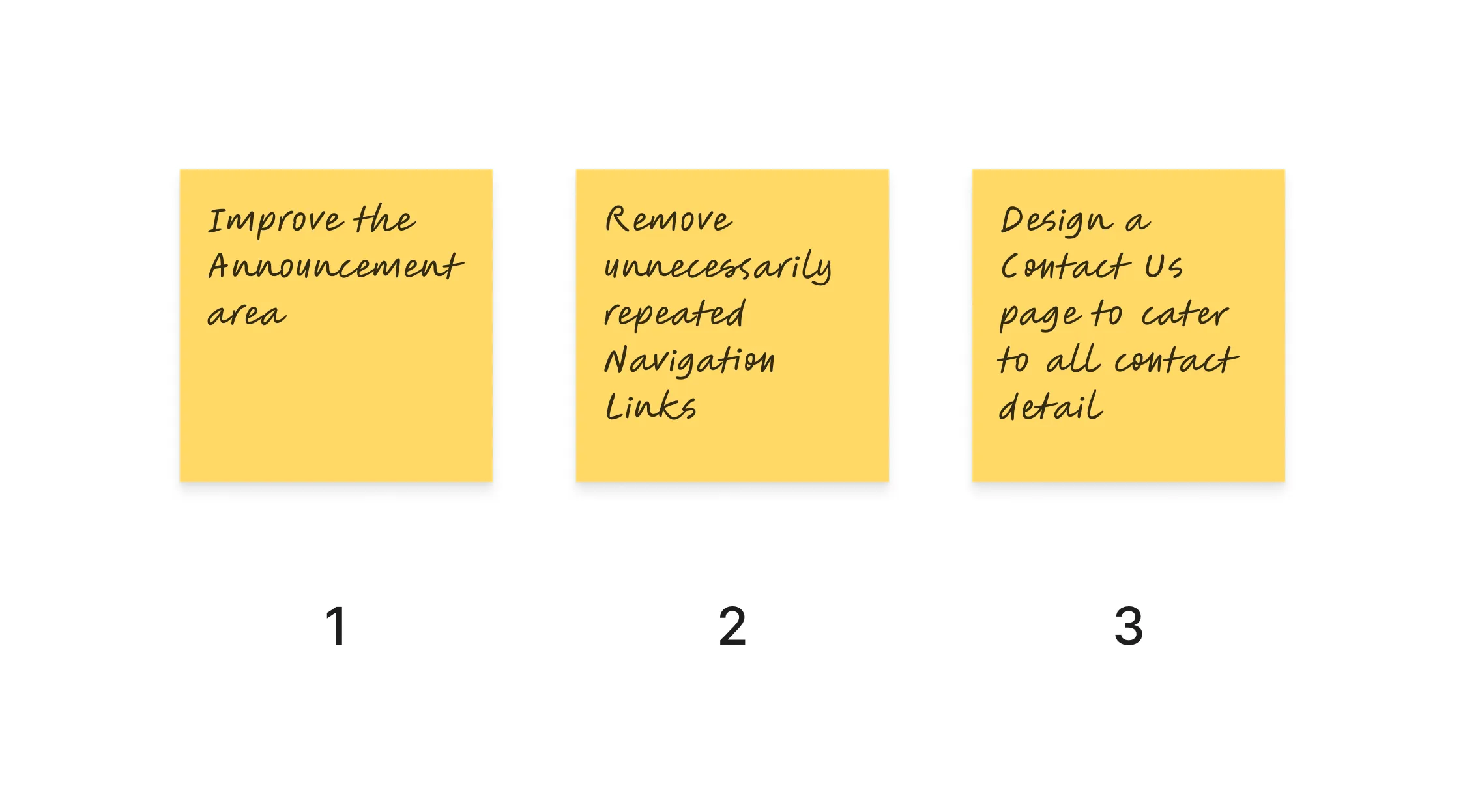
Conclusion
- Making the Announcement area less distracting for website visitors
- Removing unnecessary Navigation Links for an improved user experience
- Offering website visitors a mindless experience in having a glance at the Bank’s Contacts
Communication is very essential to the success of a project. I realized that clear communication with my colleague would save a lot in both time and resource(s).
📸 Credits: Daria Nepriakhina, Paola Aguilar & Warren Wong via Unsplash